ShopDreamUp AI ArtDreamUp
Deviation Actions

HG Designs Subscriber Area
Lots of high resolution goodies for graphic design including textures, photoshop brushes, seamless patterns and more.
$8/month


Suggested Deviants


Suggested Collections


Description
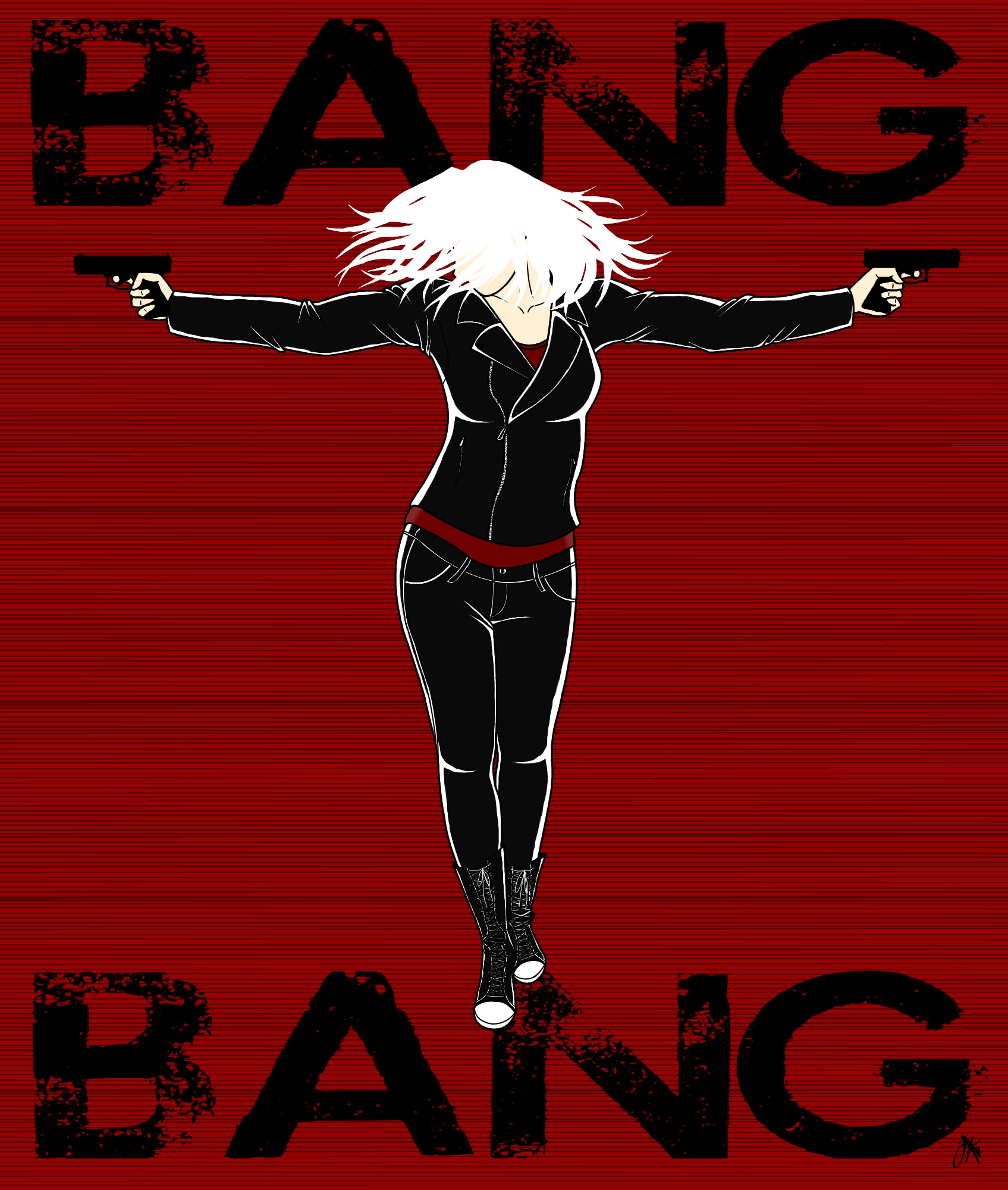
Shampoo-commercial hair flip!
After getting the line art done (without the hair), I played around with the colors and design for a long time. At first, I tried to do a brown leather jacket with dark blue jeans, but I didn't like the colors and I kept drawing a blank on the background. When I settled on black leather, I thought, hey, why not do the black and white with a splash of red cliche? I wanted a sort of Sin City feel, and after looking at some of the posters and such from the movie, I tried to make a cityscape on a black background. But then there was too much black, and the clothes didn't stand out enough from the background, and using a lighter shade of black (grey?!) made the clothes look washed-out. Then on accident, I made the background red. And I liked it. Things just kept going from there, and I ended up with a [sort of] Kill Bill inspired look. And it's no wonder, since I've been listening to the Kill Bill soundtrack while I've been working on this.
I used this awesome reference picture ([link], and subsequently borrowed the name, since it is so perfect. By the way, is my favorite reference stock-person (not sure what the official title is).
That ugly blob after the "G" in the second "BANG" is my signature, by the way.
Also, I hate this new Category selection thingy.
I have a confession: I originally looked at a picture of Justin Bieber to get the hair flip right. But he sucks even as a reference, so I flipped my own hair and paid very close attention.
After getting the line art done (without the hair), I played around with the colors and design for a long time. At first, I tried to do a brown leather jacket with dark blue jeans, but I didn't like the colors and I kept drawing a blank on the background. When I settled on black leather, I thought, hey, why not do the black and white with a splash of red cliche? I wanted a sort of Sin City feel, and after looking at some of the posters and such from the movie, I tried to make a cityscape on a black background. But then there was too much black, and the clothes didn't stand out enough from the background, and using a lighter shade of black (grey?!) made the clothes look washed-out. Then on accident, I made the background red. And I liked it. Things just kept going from there, and I ended up with a [sort of] Kill Bill inspired look. And it's no wonder, since I've been listening to the Kill Bill soundtrack while I've been working on this.
I used this awesome reference picture ([link], and subsequently borrowed the name, since it is so perfect. By the way,
is my favorite reference stock-person (not sure what the official title is). That ugly blob after the "G" in the second "BANG" is my signature, by the way.
Also, I hate this new Category selection thingy.
I have a confession: I originally looked at a picture of Justin Bieber to get the hair flip right. But he sucks even as a reference, so I flipped my own hair and paid very close attention.
Image size
1695x2000px 1.09 MB
© 2013 - 2024 Zoosteria
Comments6
Join the community to add your comment. Already a deviant? Log In
This should be on the cover of a bad-ass book!